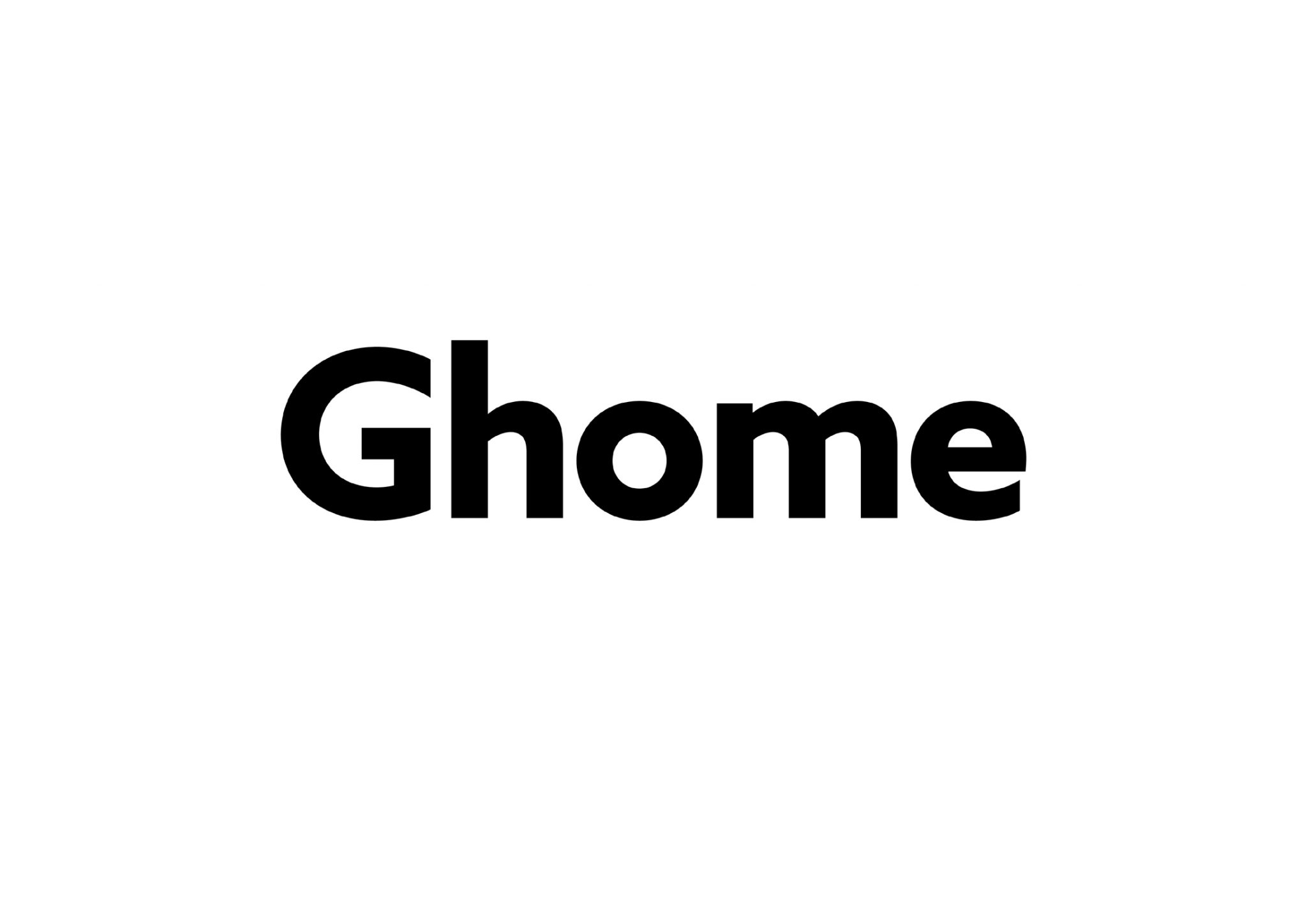
The story behind Ghome’s logo begins with a typeface – Azo Sans by R-Typography.
Having chosen Azo Sans to be the brand’s type, the idea to ask Rui Abreu of R-Typography to take care of the brand’s logotype came naturally. Our idea was to ask Rui to work the 5 letters composing the word Ghome in order to make it more logoish, while keeping the visual link to the original typeface.
Ironically or not, Rui is not a man of many words and his emails tend to be telegraphically short! It was on one of these emails that, with just the right amount of words, he told us that he would do it! Soon after, we were invited to Rui’s home-office for him to tell us about his thoughts, as well as the changes he was considering for each letter and why. It was amazing to realize how much info is hidden behind a typeface! To hear Rui talking eloquently, with much more words than he spends on emailing, about his work was also a great pleasure. Finally, to get to know only there and then that Rui’s working desk is our very own table Pinho – he got it as a present from his girlfriend, was both the confirmation that this collaboration was meant to be, and that the man really only writes the necessary amount of words on emails!
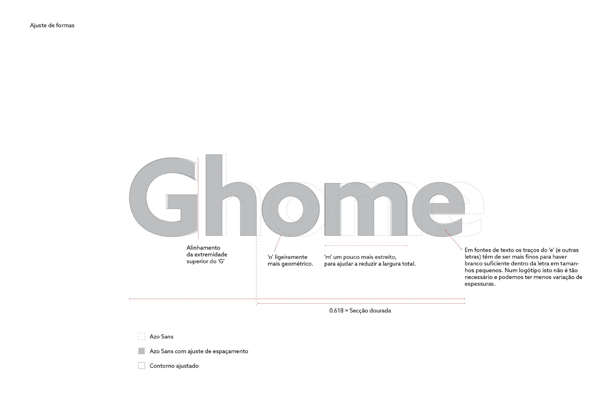
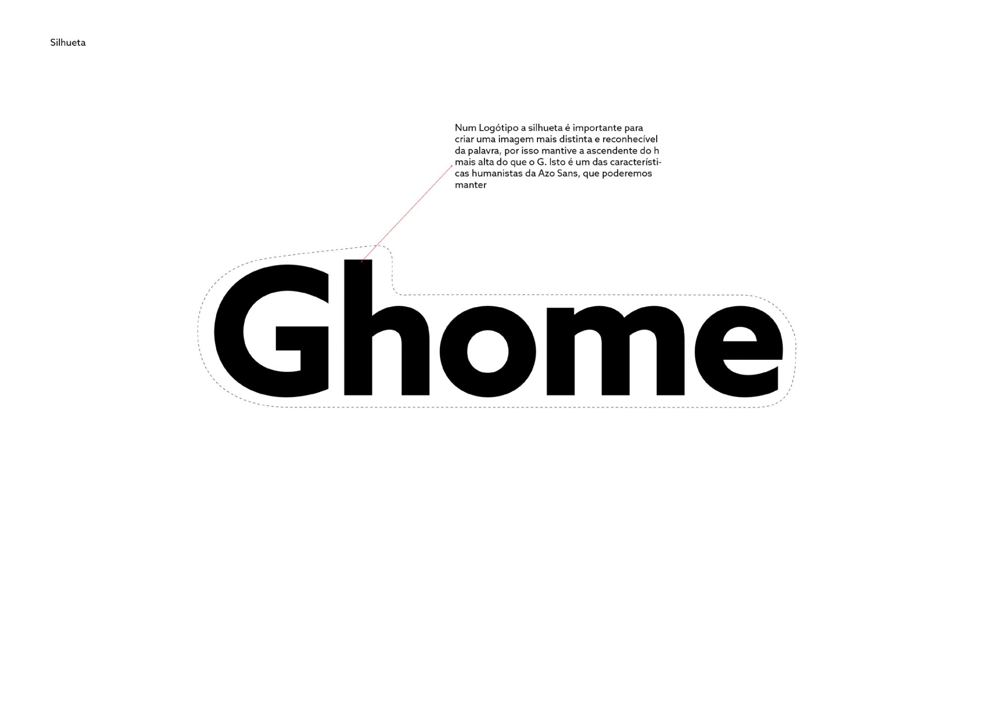
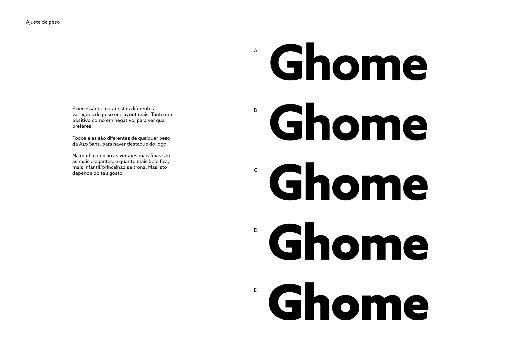
Azo Sans sits somewhere in between the geometric rationality of the constructivist types of the 1920’s and the softer, friendlier character of the Humanist Sans. Although this mixture makes up for a very versatile typeface in both big and small sizes, for Ghome’s logo we decided to make letters slightly more geometric, while still maintaining the humanist qualities. So, we decreased the variation in stroke thickness, which in type design terms means reducing the contrast; made the word more compact by tightening and adjusting spacing; and forced the alignment on the right side of the ‘G’, closing it a little bit while filling some of the white space in that area. The ascender of the ‘h’ was kept taller than the ´G’ as that helps to have a more distinct and recognisable silhouette of the word. These changes make for a stronger logo for this straightforward and pragmatic brand.